Partner Acquisition
A partner acquisition campaign is a carefully calibrated plan to draw pre-qualified and motivated potential partners to a company. This page was designed for that target audience with the intention of improving SEO.
Roles
User research, interface design, wire-framing, prototyping, and visual design
The Problem
Waiting for affiliates to come to you reduces your chances of landing quality partnerships. Currently, this company has no place to direct any potential new partners.
Finding the target audience
This was a challenge because this company has two main users: Point-of-sale companies and the merchants that utilize those POS solutions. Ultimately, we decided to focus on the end users of these businesses operating under the assumption that the various POS companies will be focusing on them as well.
Accessibility and SEO
In an effort to improve SEO rankings accessibility was at the forefront of this project. Many accessibility tests were completed like the one shown above. This displays a visual representation of what this component may looks like to someone with a diagnosis of deuteranopia, a fairly common form of colorblindness.
Findings
The company does not currently rank in organic search results.
A forced crawl from Googlebot revealed that the site had not yet been indexed.
Analytics revealed that 80% of the target audience are between the ages of 25-40.
Explorations
How do we improve search engine optimization scores with design solutions?
Based on our research of SEO trends and direct competitors we made the prediction that we could improve SEO scores by content optimization on this landing page. The main focus of this optimization was on accessibility focused design. We wanted ANY user to be able to easily and effectively navigate this page.
Core functions
SEO research and testing led to an accessibility centered design approach.
Contrast ratio
People with low vision often have difficulty reading text that does not contrast with its background. This can be exacerbated if the person has a color vision deficiency that lowers the contrast even further. Providing a minimum luminance contrast ratio between the text and its background can make the text more readable even if the person does not see the full range of colors. It also works for the rare individuals who see no color.
More than color
In addition to ensuring a high-contrast ratio, other visual indicators have been incorporated into the interface design. On the cards above plus and minus symbols as well as arrows were incorporated as at-a-glance indicators of how to navigate this section.
Thoughtful form
The form on this page was carefully curated to be easy to use and intuitive. Numbers were used to indicate the steps in the process of filling out the form. Check boxes were used to reduce the cognitive load on our users where applicable.
Brand
The visual identity was designed to be simple and modern.
The company provided their current brand identity system. They expressed a desire for a modern, clean and simple interface that was congruent with their current products.
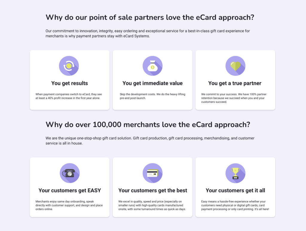
Flat imagery and high contrast complementary colors were used to create a sense of modernism and whimsy while still being accessible to a larger audience
Inside the project


